Mobile Web Design: Why It Matters for Your Wix Website
- Raeanne Dimick

- Jun 3, 2019
- 5 min read
Updated: Oct 21, 2019

If you have a website or you're getting ready to build one, you've probably heard a lot about mobile web design.
It's no secret that we spend A LOT of time on our phones. This is good news if you have a website because you can reach people right on their phone. However, this is also bad news if your mobile website totally stinks 🙊
Today, I'm going to be talking about mobile web designs tips that you should apply to your Wix website. And I'll also get into some cool Wix mobile features you have available to you.
Mobile Web Design Tips
1. Responsive Design
Have you ever been surfing the web on your phone and clicked through to a website that either A) runs totally off the screen because everything is so large, or B) looks like a miniature version of the desktop site and you have to zoom in to see things? We've all had this experience, right?
If your website isn't optimized for mobile viewing, you can bet people are going to click the back button faster than you can say, Bye Felicia!
That's where the Wix Mobile comes in. 💪 While Wix isn't responsive (yet) you can control how your mobile website looks!
Wix Mobile Editor:
Wix has its own Mobile Editor which allows you to create a totally custom mobile experience! Check out more about the mobile editor here.
With the Wix Mobile Editor you can:
- Create a custom navigation menu (colors, animation, orientation, etc.)
- Hide elements (we'll get more into that in #6)
- Change text size, orientation, and color
- Make buttons bigger
- Add the Mobile Action Bar - 1 click button where you can link things like your location, number, social channels, etc.
Overall, you want the mobile experience for your visitor to be easy to use, they shouldn't have to zoom in or out to try and read and look at elements on your website. They also shouldn't have to turn their phone into landscape view to look at elements that are running off of the page. <<< Make sure nothing is running off 😉
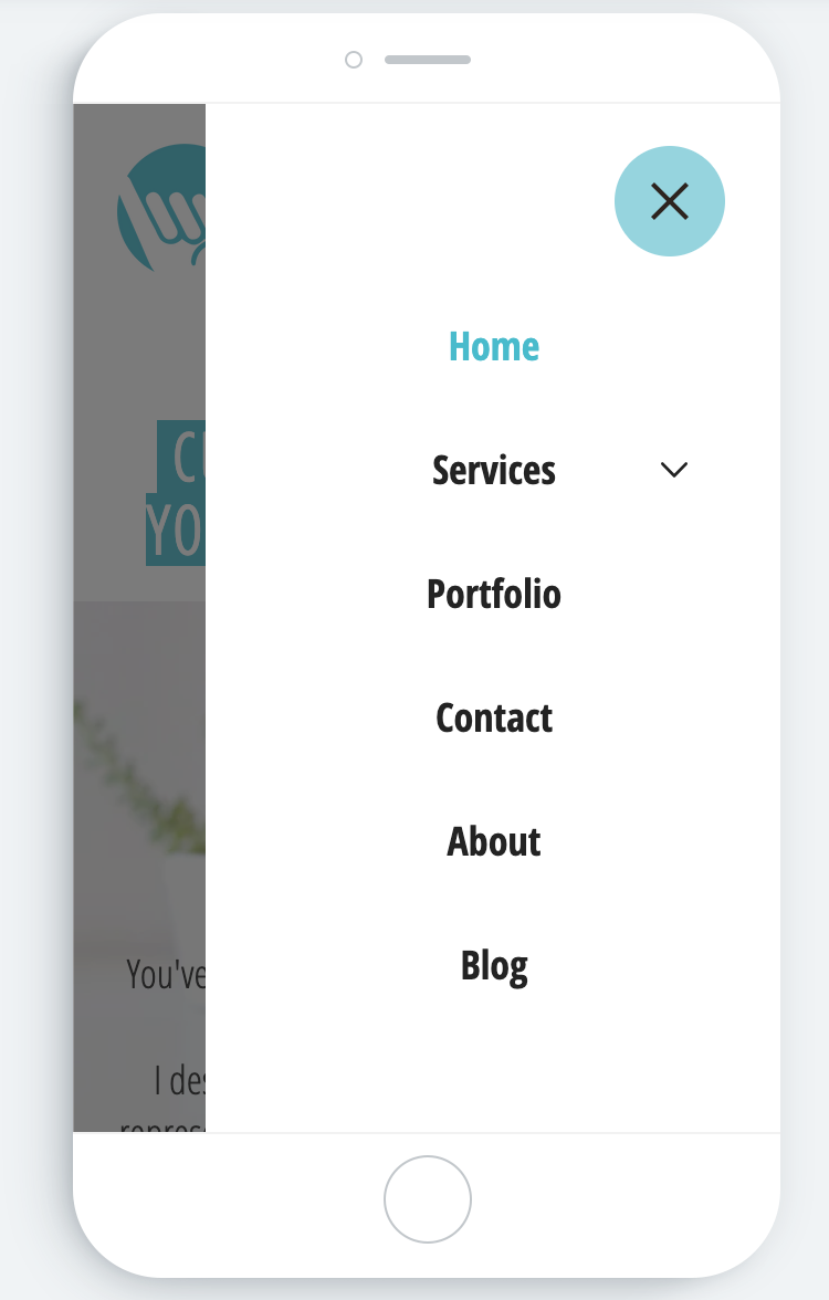
2. Easy & Clear Menu
Your mobile website menu should match your desktop menu. The only thing that changes with the mobile website is that your navigation menu is now a button people click to open the full menu options.
Menu Button
It should also be very clear for visitors on how to access your menu. A good rule of thumb (get it?! 👍) is to keep your mobile menu button in the top left or right corner of the screen. I've also seen many websites put it in the middle, this is fine too 😊 Just make sure it's intuitive and obvious for them to find.
A little web design lingo: most people refer to this as a hamburger menu, because most mobile website menus look like this....

It looks like a hamburger right??? 😋🍔
Since we're talking about the menu button, let's also chat about the drop-down navigation menu. I'd recommend making the text a little larger than you normally would on your desktop site. This just makes it easier for visitors to touch the menu option they want without fat-fingering the one they don't want.
In Wix, You Can:
- Change the menu font size, color, and orientation.
- Have the option to have the menu pop out from the left or right of the screen or even cover the screen.
- Customize the menu button with different colors, symbols, and even animation!
3. Clickable Links, Phone Numbers, & Buttons
Everything on your desktop site should already be clickable and there should be no broken links. Make sure and double check this 😊
Links
If you've already linked any text on your desktop site that takes you to another page on the site or an external link, then you're good to go for mobile. You won't have to re-link anything on the mobile side once it's linked on the desktop site.
The one thing I recommend is to make the text for this link larger (so you can easily tap it with your finger). More on larger fonts in the next section.
Phone Numbers
You can also link your phone number in the Wix editor so that it's clickable from both desktop and mobile. It's super simple to do:
1. Highlight the text (phone number) you wish to link
2. Copy the text (phone number)
3. Click on the chainlink icon
4. Choose the Phone Number option
5. Paste the text and click done
Easy peasy! If you need a visual demo click here.
Buttons
Last but not least, make sure you make your buttons bigger on your mobile site. You can easily adjust these sizes in the Wix Mobile Editor. Don't make them huge, but make them a size that's comfortable and easy for your thumb to tap it.
4. Use Larger Font Sizes
Screens are much smaller on our phones (duh). So it makes sense to increase the font size a little bit.
On desktop sites, the general rule is no smaller than 16px.
On phones, you may need to bump it anywhere from 17px-20px (for paragraphs) depending on the font you're using.
When you're increasing the font size in the Wix Mobile Editor, you may also want to change the alignment of the text. Sometimes, if your font was originally centered on your desktop site, it may look better aligned left or right on mobile. Play around with it and see what looks best,
Again, test this on your actual phone once you've published the changes. The font may look large enough in the editor, but it might show up smaller on your phone.
5. Avoid Pop-Ups (Lightboxes)
I don't generally recommend pop-ups (or Lightboxes as they're called in Wix) on your mobile site, they can cause a lot of problems and leave people frustrated.
But, if you're not going to take my advice...here are some things to keep in mind with lightboxes - let's roll with that term for now since we're talking Wix 😉
- Resize the lightbox window in the mobile editor. I wouldn't make it larger (lengthwise) than the screen.
- Make it suuuuuper easy for people to tap the "X" to close out of the lightbox (test this on your phone)
6. Cut Down the Content
Wix has a really cool feature in the mobile editor, and that is the ability to hide things.
At first, it might sound weird and you might be thinking to yourself, why would I what to hide things?
When it comes to mobile websites thinks of your content in terms of sound bites. If your website is content rich and heavy, you don't want alllll of that on your mobile site too. People aren't on their phones to do deep research and read through your entire website, they want information fast and it needs to be concise.
Here are some examples of things you could hide:
- Repeat calls to action strips or buttons
- Your logo in your footer, multiple badges/certificates
- Menu options/buttons in your footer
- Any element that doesn't translate well to mobile (shapes, lines, graphics, etc.)
These are just examples, I'm not saying you HAVE to hide all of these things, I'm just giving you some ideas.
Hiding Elements in the Wix Mobile Editor
All you need to do to hide an element is click on it and click "Hide" in the left sidebar menu. If you want to unhide it, simply click Hide in the sidebar menu and click the element you want to show.
Until next time...Hang Loose! 🤙🏻
Do you want to be notified when a new blog is posted? Awesome!
Drop your name and email below and you'll be the first to know!
You'll also get an email from me once per week covering Wix, marketing or small business.
Don't want it? No sweat, you can unsubscribe super easy :)


Comments